With over 64 partners in 130 countries who employ over 4,000 members of staff between them, UNIBA Partners are a network of brokerages with a truly global reach.
Each partner is strategically selected to join and is tested to ensure they meet strict levels of quality so that they adhere to client centric principles. As a partnership each partner can work across borders with other members, confident that they offer the same high standards of service as they do.

Positioning
Partners will use the UNIBA Partners website as an extension of their marketing tools. We identified a key user journey where a client will visit both the partner’s site and UNIBA Partners's concurrently. It was important that the overall design and aesthetic of the UNIBA Partners site weren’t overly dominant and allowed the partner’s marketing materials to shine through.


However, another key objective of the site was to entice newly invited partners. For this audience group the site needed enough gravitas to feel relevant.
Striking the right balance between these two objectives and audiences was a challenge. We purposely chose a minimal but elegant style that had just enough character to be its own piece of marketing collateral but without it getting in the way or feeling more important than the partner websites.
To show UNIBA Partners’s scale (something that would appeal to clients and new partners) we gathered large scale statistics, punching them through the website.


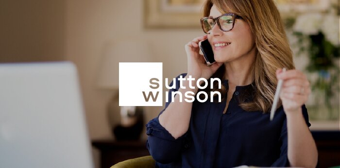
After attending a UNIBA Partners dinner event in London and spending time with the partners, it soon became obvious how much they respect each other and that their collaborative approach is fundamental to their business model. The home page features real photos of partners with real quotes from them talking about what UNIBA Partners means to them. The partners were so proud to be part of UNIBA Partners they were more than happy to associate their face with it - a powerful message.
One of the key reasons a partner joins is that by working with partners in other countries they can offer international services as part of their business. This is conveyed throughout the site using content. From a visual point of view we wanted to avoid a reliance on tired stock photography showing international city scapes. Instead we created custom made illustrations of famous landmarks. These were uniquely created for UNIBA Partners ensuring that they wouldn’t be seen on any other websites and the illustration style conveyed a friendly and relaxed feeling while maintaining a corporate edge.


We designed and built an extranet that enables easy communication and collaboration between partners. This wasn’t merely an add on—it provides the platform that glues the partners together.
The extranet works across different devices, allowing partners to use it on the move. Much of the focus of the design was around creating something that was simple and easy to use. It features an area where partners can ask and answer questions as well as an intuitive and searchable assets and documentation area.
In order for partners to find out about each other and know who to contact we built an extensive directory with profile pages for each brokerage and their employees. This database needed to be searchable and it was critical that we got the UX right for this. The search form was split between users searching for companies or people that they already know and users who needed to find a certain expertise in a certain country.
From experience of using similar tools, we know that getting too many notifications can lead to them being ignored. To alleviate this we created a notification centre where partners can choose what type of notifications they are interested in and how often they receive them.


The Future
We’re more than pleased that UNIBA Partners has decided to become one of our retained clients. We’ve already produced a video for their recent conference in Valencia and work has begun to design a visual identity that will increase brand recognition and consistency.
As a retained client, we’re able to be proactive and constantly improve the website over time. We see the website as only the beginning of our partnership with UNIBA Partners.
“Liquid Light impressed us with a thought-provoking and highly effective approach to thinking about our brand and producing our new website. Imaginative, patient and yet challenging – this was a very professional process. We never imagined that we would be so delighted”