Tables in responsive design
I recently came across an issue that involved scaling down a large table of content to fit into a mobile device view. This article highlights the implications of using default tables within responsive design and suggests different methods to use.
When a default table is viewed on a mobile device, it pushes out the widths of the site allowing the user to scroll horizontal. Although this allows the user to view all the table content, it does not do your responsive site any justice.
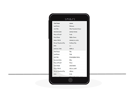
Examples of default tables
An option could be to hide selective information when viewed in the mobile view, however the user should not miss out on content just because they are using a mobile device. To help decide how your table should scale down, its worth thinking about who or what the table is designed for.
Points to consider
How much data does your table contain
What platform will the tables be created on (eg. CMS, Static HTML site)
How will the tables be created (eg. CMS table builder, hand coded )
Who will be creating the tables (Does the user have any technical skills or not)
Does the user have access or the ability to write CSS or JavaScript
Various solutions
Here are various examples demonstrating different approaches fitting a table into a responsive layout. These methods change the display of the table using a combination of CSS and JavaScript.
PDF option
You can save out an Excel document as a pdf then upload it to your site. When the website is viewed on a large screen the table will be visible. When the site is viewed on a mobile device the table will display hidden and a link to the pdf document will show instead. When the link is clicked the user will be directed to a page where they can view the pdf file. This change can happen using a simple CSS media query to hide the original table and display the pdf link.
Pros:
- Easy to apply to the site
- Added bonus to download the file
- Only need a simple CSS media query to hide the original table and display the pdf link
Cons:
- Takes the user away from the page
- It is possible the link will not get clicked on
Horizontal scroll container
You can allow the user to horizontally scroll the table by placing it inside a container with overflow: auto; and overflow-y: hidden;. Once the page width becomes smaller than the table, the container will mask the table to keep it within the page width. The user can then scroll left and right with their finger to view the table contents. This can be easily applied using a simple CSS media query.
Pros:
- Easy to apply with CSS
- Keeps the user on the page
- Does not affect the page width
Cons:
- User may not be aware they can scroll horizontally
- Difficult to view the table content all at once
- Requires the user to scroll horizontal
Pie chart option
This option takes the table data and converts it into a pie chart. This is a clever approach but pretty limited for displaying large table data in a user friendly manner.
Pros:
- Compacts the data to fit on the page
Cons:
- Table content is difficult to translate
- Limited to how much content can be viewed
- The table becomes a pie chart
Selectively displaying data option
This option allows the user to select which data to view in the table through a drop down menu. Although this is a good solution, I feel the user experience is limited on a mobile device. It does not solve the problem of viewing all of the data at once.
Pros:
- Compacts the table down to fit inside small screens
- Allows user to choose what they want to view
Cons:
- Does not fit on the screen when all data is viewed
- It could be annoying selecting box’s to view content
Horizontal scrolling option 2
This is a good solution for keeping the table format the same as when it is viewed on a larger screen. When viewed on a small screen the table splits into two horizontal scrolling columns. This allows the user to pan left and right using their finger to view the table data.
Pros:
- Suitable for large table content
- Allows user to pan separate columns
Cons:
- Uses JavaScript Polyfill to activate the change at a set width
- Requires the user to scroll horizontal
CSS responsive Table
This options seems to be the best option which can easily be applied across different platforms. It uses CSS media queries to reformat the table into a mobile friendly view. All of the data remains readable and it eliminates the need to scroll horizontally. See Chris Coyier’s comment located in the link below, he explains how all the data can be kept in the HTML.
Pros:
- Rebuilds the table to fit into mobile view
- No horizontal scrolling
- Creates easy to read table
- Does not need Java Script
Cons:
- May lead to a long page of contents
- May not work well with complicated table content
Links: http://tinyurl.com/6cgqd8p (Source)
http://tinyurl.com/85e9cso (Demo)
http://tinyurl.com/qcrl9mf (Chris Coyier’s comment to keep the content in the HTML)
So which type of responsive table to go for?
Deciding which approach to take all depends on your specific projects need. There isn’t a right or wrong solution. It really just depends on how you want the responsive result to look. I personally find the last example most appropriate for my needs but you may not find this. It all depends on what you are trying to achieve. See the checklist below to help decide which table solution to use.
Checklist to help choose the best table for your
| Type of Table | CSS | Java Script | Suitable for large table content | Usability rating out of 10 |
| PDF option | Yes | No | Yes | 4 |
| Horizontal scroll container | Yes | No | Yes | 7 |
| Pie chart option | Yes | Yes | No | 2 |
| Selectively displaying data option | Yes | Yes | No | 4 |
| Horizontal scrolling option 2 | Yes | Yes | Yes | 7 |
| CSS responsive table | Yes | No | Yes | 9 |
May 2014 Update
Just a little update to help make your life easier. Here is a group of plugins that will convert your tables into response tables.
May 2016 Update
Now that the flex-box property is well supported there are a few techniques that use this. However, as far as we’re aware, all of these techniques require you to change the mark-up so that it doesn’t use the table element. To keep the article short, we haven’t included a detailed breakdown of these techniques but you can find out more about flex-box responsive tables here. Please let us know in the comments if you think we should include these.
There’s a great collection here of examples on codepen and an excellent run down of tables in general over on CSS tricks.